
The statistical masterminds over at FiveThirtyEight might be best known for their analyses of American politics, but that’s not all they do. With their latest infographic, they’ve turned that analytical eye to a galaxy far, far away.
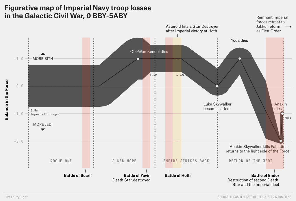
The chart, which you can find below, is a Sankey diagram based on Charles Minard‘s 1869 illustration of Napoleon’s invasion of Russia (which also demonstrates why you should never get involved in a land war in Asia). The horizontal grey band represents the strength of Imperial forces at any given time, with the vertical red bands representing indicating the events of the films, from ‘Rogue One’ through ‘Return of the Jedi’.
As the chart illustrates, the Empire’s biggest error may not have been “tightening [its] grip” politically, as Leia suggests to Tarkin in ‘A New Hope’. Rather, it was the concentration of their forces on massive capital ships like Star Destroyers and especially the two Death Stars, as their biggest losses come from the battles at Yavin and Endor. Between the two, we can clearly see that it was the decimation of the Imperial Starfleet that allowed the Rebels to triumph, perhaps even moreso than the deaths of Darth Vader and Emperor Palpatine. Make sure to click on the image for a larger view:
‘Rogue One: A Star Wars Story’ is now playing in theaters. You can find our review of the film here.