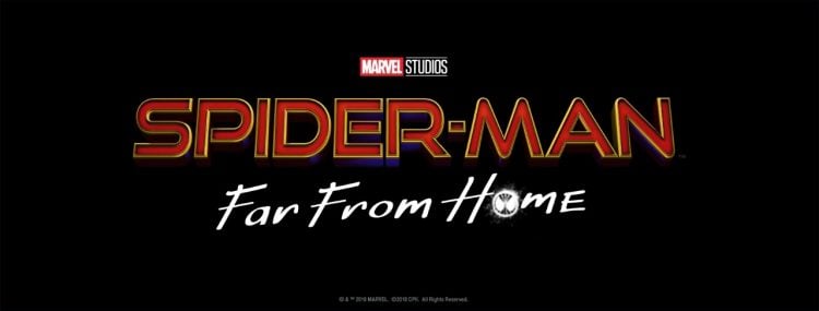
Thanks to another leak from Tom Holland we had learned that the next outing with The Wallcrawler would be ‘Spider-Man: Far From Home’ and now Marvel Studios has decided to grace us with the official logo from the film. Surprisingly, they didn’t “accidentally” show it to Holland to leak to us.
The ‘Spider-Man’ logo itself has gone through a few minor changes. Gone is the almost whimsical curvy style from ‘Spider-Man: Homecoming’ as we’re now seeing bold red letters with only a hint of blue and yellow to it. You almost have to wonder if this is supposed to give us a more serious tone right off the bat as we know that this is the first Marvel Cinematic Universe film to take place after the events of ‘Avengers 4.’ With Spidey having somehow returned from the big Thanos snap felt around the galaxy and likely having lost a mentor or two, we’ll probably be seeing how Holland deals having that Parker Luck comic fans are all too familiar with.
Of course, I could just be overly reading into this. Even though we’re never supposed to judge a book by its cover, nearly everyone does and the first logo to be released might be hinting at the direction of the movie.
At this time, not much of the plot has been fully confirmed outside of the timing of the film. However, a potential slip of the tongue may have shared that we’ll be seeing Jake Gyllenhaal in the film and that both Samuel L. Jackson and Cobie Smulders would be working with Spidey as Nick Fury and Maria Hill.
Do you dig the official logo for ‘Spider-Man: Far From Home’? Does the more straight-lined appearance hint at where the mindset of Peter Parker will be at the onset of the film or am I overreading into what this logo means? Share your thoughts below, True Believers!
